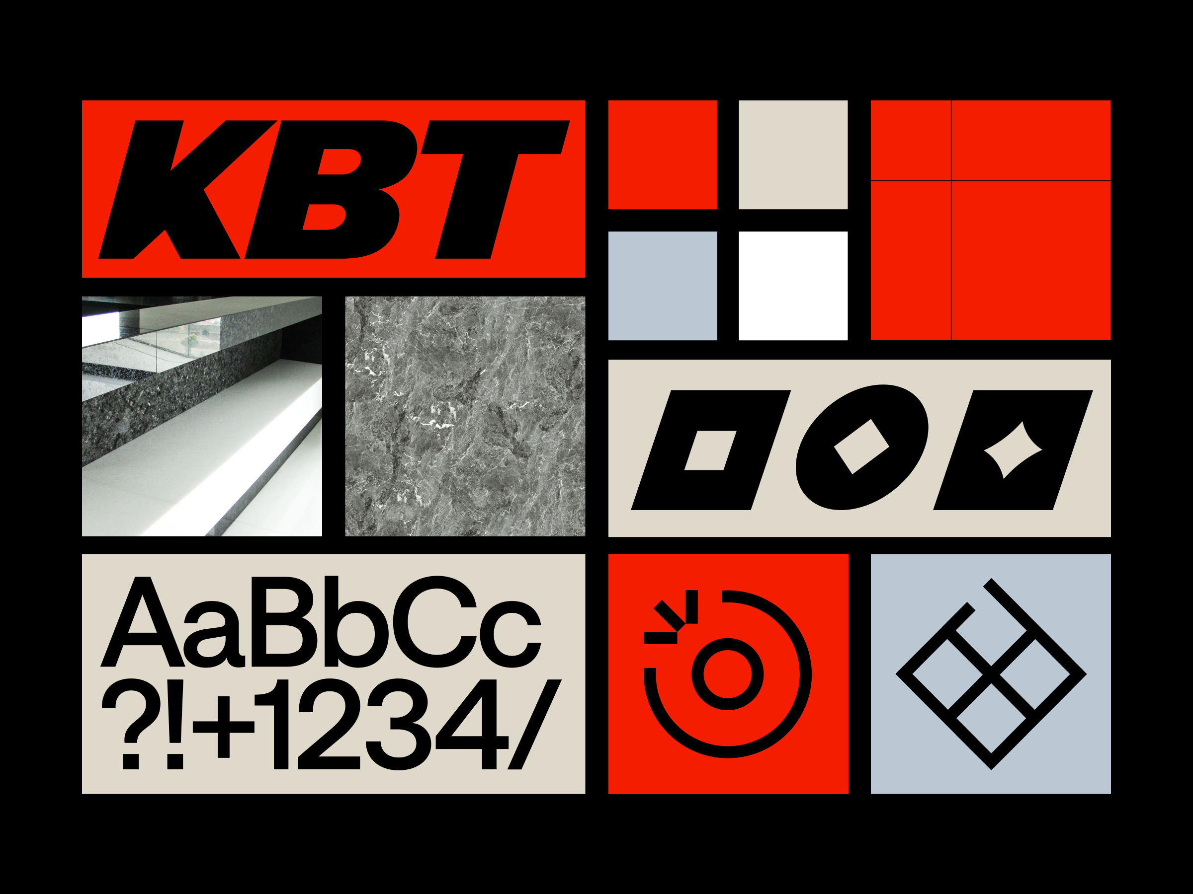
KBT
Brand identity project for KBT, specializing in high-quality natural and technical stone craftsmanship.


Design
Tomáš Paulen
Jakub Otčenáš
Motion Design
Martin Darnadi
The rebranding for KBT encapsulates the essence of transforming raw stone into refined products, reflected in a dynamic wordmark that evolves from a solid block to the title letters through a custom variable monospace typeface. This transformation highlights the craftsmanship and precision in stone processing, a distinctive feature of KBT's services.
Supporting this, the primary typeface, Saans by Displaay Type Foundry, complements the logo's aeasthetics, while a secondary custom-made type, KBT Blocks, emphasizes the brand's foundations, and numerals in various weights.
The design layout, inspired by CNC and water jet stone cutting techniques, mirrors the precision and clean divisions in stone work, employing a grid system that echoes this accuracy. The color scheme—red, white, black for primary, and stone beige and grey blue for secondary—draws from the natural and technical stone palette, grounding the brand's identity in its core materials.
Overall, the new brand identity is minimalistic yet sophisticated, reflecting KBT's commitment to detail and excellence in stone processing.


Want a potential surprise in your inbox?
It might be inspiration from us, every now and then. No regular schedule, just when it feels right.